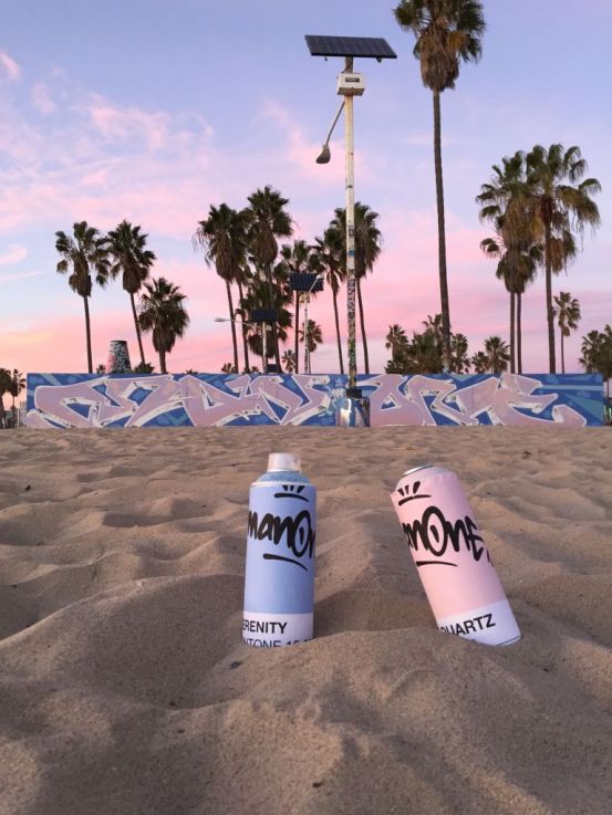
 Today Pantone unveiled their colours of the year. I’m excited about them for a couple of reasons.
From a design standpoint, I love that they choose diverse shades that offer a broad spectrum appeal — these powdery hues transition seamlessly from a Victorian tea parlour, to modern wedding scene to the California cool graffiti murals used to promote the shades on social media this week. (Checkout more of these beautiful photos on the Pantone Twitter feed. )

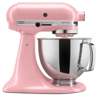
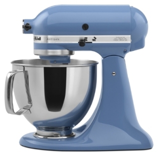
I’m sure fashion forward brands from all over the planet will be launching into these shades soon enough. In fact, Kichen Aid is already on it, launching counter top appliances in the colours that are sure to be great sellers. Check out the full details on these new products here.


Beyond the aesthetic, I truly love the nod to gender equality and neutrality in design and fashion. Engaging gender equality in the everyday is how we will move to a better place as a society on whole. It’s all about the love people! Kudos Pantone.
Off You Go paper Co. Custom sizing and Pantone matching to Interior Designers
Off You Go paper Co. prints are customizable for designers. We can work on size and pantone matching to suit your needs. Off You Go custom artworks are already used by Vancovuer designers to stage display and designer show homes. Our service is fast and affordable. Have a peruse of the inventory here . Reach out to brit@offyougopaperco.com for more information and detailed quotes.